

 by Ken Lopez
Founder/CEO
A2L Consulting
To be clear, my definition of great design includes everything from an interface like what one sees in a Tesla to the adaptive reuse of a historic structure to a well-crafted litigation graphic that tells a story clearly and without the need for further explanation.
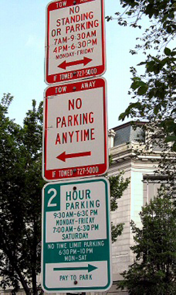
One place we don't expect to see great design is in parking signs, when we are parking the car and trying to figure out where to park and where not to park. I live in Washington, D.C., where they have some signage that would seem to violate every principle of great design. This one pictured here is a classic, and you probably have some just like it in your town.
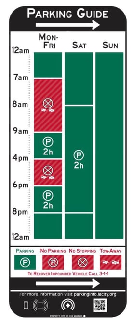
Does that look familiar? Well, one pilot program in Los Angeles is trying to change all that and make parking signs inspiring from a design perspective. Each sign contains a simple chart that is immediately clear to almost anyone. Green and red overlaid with symbols helps provide a clear message. Here’s an example below.
 There is of course a lesson for the courtroom here. Clear design matters, and it matters a lot. If your litigation graphics look more DC than LA, you’re probably leaving judges and jurors frustrated -- just as frustrated as you feel when you’re trying to interpret a poorly designed sign with lots of text.
As Jonathan Ive, Apple’s longtime chief designer and a close associate of the late Steve Jobs, once said, “Make each product the best it can be. Focus on form and materials. What we don’t include is as important as what we do include.”
Let's review seven key principles of good design when it comes to the courtroom.
- In all presentations, ban the bullet point. The only thing that on-screen bullets kill is your persuasion.
- Use well-crafted exhibits. The better looking your trial graphics, the better received you will be.
- Don't use only pictures. People learn in different ways, and both surprise and changing mediums of persuasion will make you more effective.
- Don't use only words. Same as above.
- Don’t use only static slides. You want to present more like the national news and less like a CLE.
- Use lots of slides. More slides is generally more effective.
- Stick to one concept per click. People need more time to digest information than you think they do.
If you start here, you may not be as great a designer as Ive, but you will be a long way down the right path.
Other A2L Consulting articles and resources focused on good design in trial graphics, litigation graphics and persuasive visuals generally:
- 10 Reasons The Litigation Graphics You DO NOT Use Are Important
- Why Expensive-Looking Litigation Graphics Are Better
- The 12 Worst PowerPoint Mistakes Litigators Make
- Trial Graphics Dilemma: Why Can't I Make My Own Slides? (Says Lawyer)
- How I Used Litigation Graphics as a Litigator and How You Could Too
- Why the Color of a Dress Matters to Litigators and Litigation Graphics
- How Valuable is Your Time vs. Litigation Support's Time?
- 12 Reasons Bullet Points Are Bad (in Trial Graphics or Anywhere)
- 16 PowerPoint Litigation Graphics You Won't Believe Are PowerPoint
- What Does Litigation Animation Cost? (Includes Animation Examples)
- 16 Litigation Graphics Lessons for Mid-Sized Law Firms
- 13 Reasons Law Firm Litigation Graphics Departments Have Bad Luck
- Will Being Folksy and Low-Tech Help You Win a Case?

Leave a Comment