


by Ken Lopez
Founder & CEO
A2L Consulting
Charts don't lie, people do.
As demonstrative evidence consultants, we see a lot of charts and graphs that are designed to mislead or that end up misleading the viewer, and ultimately the jury. I don't think it is always intentional on the part of the trial team. Sometimes, a demonstrative evidence consultant is to blame for introducing a misleading tactic. This article will help you spot those misleading charts before they do damage.
Remember that each piece of demonstrative evidence is subject to the balancing test under Rule 403 of the Federal Rules of Evidence, among other evidentiary standards. Under Rule 403, an otherwise relevant demonstrative will be excluded when its probative value is substantially outweighed by unfair prejudice, its cumulative nature or if confusing or misleading.
For example, I believe that a chart using any of these five techniques described below runs the risk of not passing muster under Rule 403; however, objections to demonstrative evidence are relatively rare. Successfully make the objection during trial and you might just call the credibility of your opponent into question.
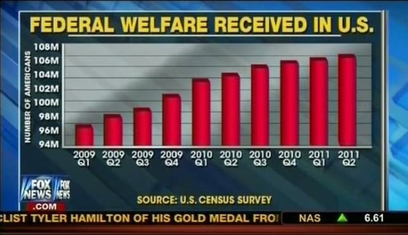
1) The Slippery Scale: This is the most common trick I see, and once you know about it, you'll see it everywhere too. By setting your y-axis (the vertical one) to a narrow range not including zero (e.g. below, 94M to 108M), it is easy to make relatively small changes look enormous. For example, the Simply Statistics blog recently highlighted this technique used by Fox News. Here, this trick makes changes in the welfare rolls that are relatively small seem enormous.
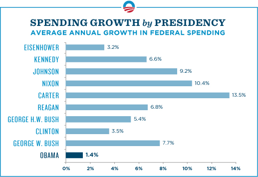
2) Compared to what? If you want to show a small change on a percentage basis, all you need to do is vary your x-axis (the horizontal one) so that time is literally on your side. The Obama campaign truncated its timeframe in its spending chart, claiming that in 2010, President Obama presided over the smallest increase in spending in 50 years. While technically true, 2010 was being compared to 2009, the year that the one-time stimulus spending (championed by the Obama/Clinton/Biden Congress) ballooned government spending by 18%. I wrote about this previously.
3) The Percentage Increase Trick? How many times have you heard someone talk about a 200% increase and really wonder exactly what they are trying to say? Do they mean it doubled, it quadrupled or something else? If they are using the percentages correctly, a 100% increase is a doubling and a 200% increase in something is a tripling – three times as much as at the outset. However, the trickery comes in where one might say in a chart that the same 200% increase is 300% of the first figure or a threefold change. To help stay accurate and monitor your opponents, use A2L's Percentage Calculator for Lawyers below.
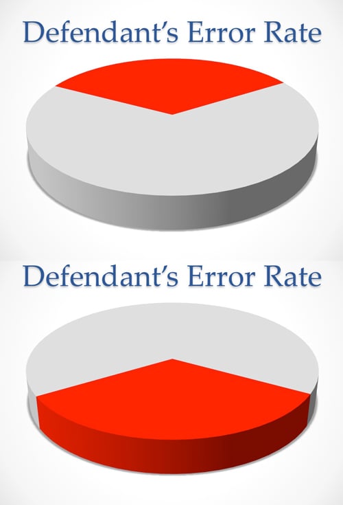
4) Tricking the Eye with 3D Charts: Flat charts with no depth or 3D aspect are harder to trick the viewer with, so always scrutinize your opponent's charts when the third dimension introduced. For example, have a look at the two pie charts below. Both red areas are the same percentage of the pie, but if you are like most people, when the slice is closer to you, it looks bigger. A similar trick can be used with bar charts.
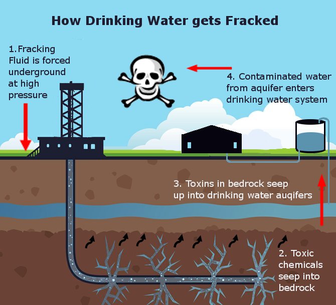
5) Misleading emotional imagery: Putting an image of a homeless person in the background of a chart about increasing homelessness is designed to evoke emotion. It might be admissible since it is clearly tied to the underlying issue. Showing an oil-covered bird in the background in an explanation of how much oil was spilled would not add to one's understanding of the amount of oil spilled. Some examples of emotional imagery in charts that add little probative value but add undue prejudice are below.
This one is used to sell water filters, but if used in court in a fracking lawsuit, the poison symbol would (if objected to) rule the chart inadmissible.
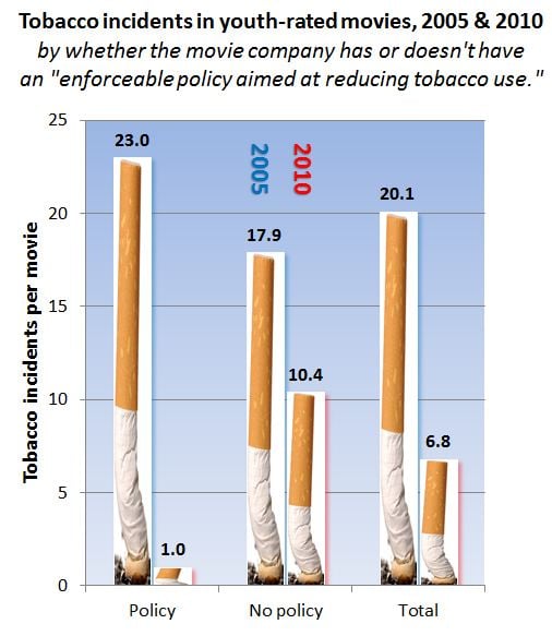
Since it requires the viewer to decode several different riddles before understanding the message, the chart below is a model of poor chart design worthy of its own blog post. This riddle-making mistake is commonly made by those without training in preparing demonstrative evidence and non-demonstrative evidence consultants. Here a legend is used (generally speaking, this is always a bad idea), so you have to first find that. Then you have to read sideways - twice - in two different directions. Then you have to figure out from the subtle color coding of the legend that blue is left and red is right. THEN, you have to determine that left is 2005 and right is 2010. It's a chart mess, however, it provides a good example of some imagery that would potentially be objectionable. The cigarettes being snuffed out add little to the message and are there only for emotional impact. Close call though. Do you think this chart would be excluded in your jurisdiction - leave a comment below?
Other resources about demonstrative evidence or demonstrative evidence consultants:
- Free E-Book: Demonstrative Evidence in Patent Cases
- Free E-Book: Demonstrative Evidence in Antitrust Cases
- Free E-Book: Demonstrative Evidence in Environmental Cases
- Free E-Book: Demonstrative Evidence for Litigation Support
- Free E-Book: Demonstrative Evidence: Preparing Trial Timelines
- Free E-Book: The BIG Litigation Interactive Book


Leave a Comment