

Finally. High-quality litigation graphics made an appearance at the impeachment trial. If you are a trial lawyer or you help trial lawyers, this article is a must-read, because it will help you see the future and help you persuade better.
I've published three recent articles about the impeachment hearings/trial and the litigation graphics and technology used:
- 5 Litigation Graphics Lessons from the Impeachment Hearings
- Who Won the Impeachment Trial Initial Opening Statements?
- Impeachment Hearings Provide Trial Technology Lessons
I thought those three articles would be my last on the subject, and then something impressive happened. Objectively effective litigation graphics were (finally) used on Day 6, and they offer a look into the future for all trial lawyers.
The first five days of the impeachment trial left me feeling sad for those rare few of us who are experts in the art and science of litigation graphics. For the most part, the PowerPoints used were better than nothing but fell far short of maximizing persuasion (based on current persuasion science). They looked like what lawyers can create on their own, what you see at most trials, and what you see in most corporate conference rooms. They were ugly and flawed. Again, though, they were better than nothing.
When defense counsel presented opening statements on Day 1 of the trial and used no visuals, I was confused. I know the background of some of these lawyers and have worked with some of them. I know they know better. It was disheartening.
And then came the opening defense arguments on Day 6, and finally, excellent litigation graphics made an appearance.
As I've said before, none of my articles are political in any way. I am only commenting on the quality of the litigation graphics presentations and technology used. I'm leaving the content entirely alone. Nevertheless, I know it's hard to separate the litigation graphics from the messenger if you feel strongly about one side or the other. But, if you are a trial lawyer, you really should be able to separate the two.
The litigation graphics used on Day 6 were very good - both from a persuasion science standpoint and from an artistic standpoint. I appreciate the sophistication of them as they now can help me explain what good PowerPoint looks like (without getting into our presentations which are often sensitive or confidential). Let's discuss five key points and briefly discuss what you can learn from them.
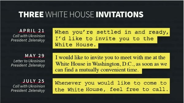
1. These litigation graphics were more like a news graphic than a trial graphic.
The national news industry is years ahead of most of the legal industry in creating memorable and persuasive graphics. I've written about this in articles like 10 Things Litigators Can Learn From Newscasters and Watch The Weather Channel Use Animation to Persuade.
The most important thing to consider when creating litigation graphics for a jury is to ask yourself, "what are jurors used to seeing in their lives?" An image like the one on the left (top for mobile) or more like the one on the right (bottom for mobile)? The answer is simple. Jurors see things like the image on the right constantly on the news and elsewhere. It is what they expect. The image on the left is what lawyers are used to seeing (or creating). The image on the right is what jurors are used to seeing. Don't confuse the two, and don't forget that your audience is who you are designing for.
Here, the litigation graphic on the right is not just aesthetically more attractive; it is scientifically more persuasive. Professionally designed slides get better results. Science says this, and it has always been true in my experience. See Do Professionally Designed PowerPoint Slides Get Better Results?
2. Memorable animated graphics with sound.
I would not have recommended this one, but they did it, and I think it probably worked. Still, to me, it felt beneath the Office of the President. But, sometimes gimmicky works because it's memorable. See Could Surprise Be One of Your Best Visual Persuasion Tools?
Other than when playing a deposition clip, a patent technology tutorial with a voiceover, or when playing back video of some underlying subject in one of our cases, in 25 years, we have never added a sound effect to a litigation graphic for effect. The defense did, and it is worth noting because I bet they have broken the ice on a trend.
Here, the calendar flipping effect is something we have all used in this line of work. However, coupling that with a sound effect of a calendar flipping is a groundbreaking change.
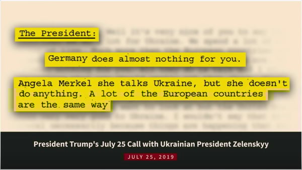
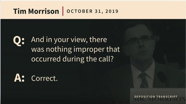
3. Document callouts are all retyped.
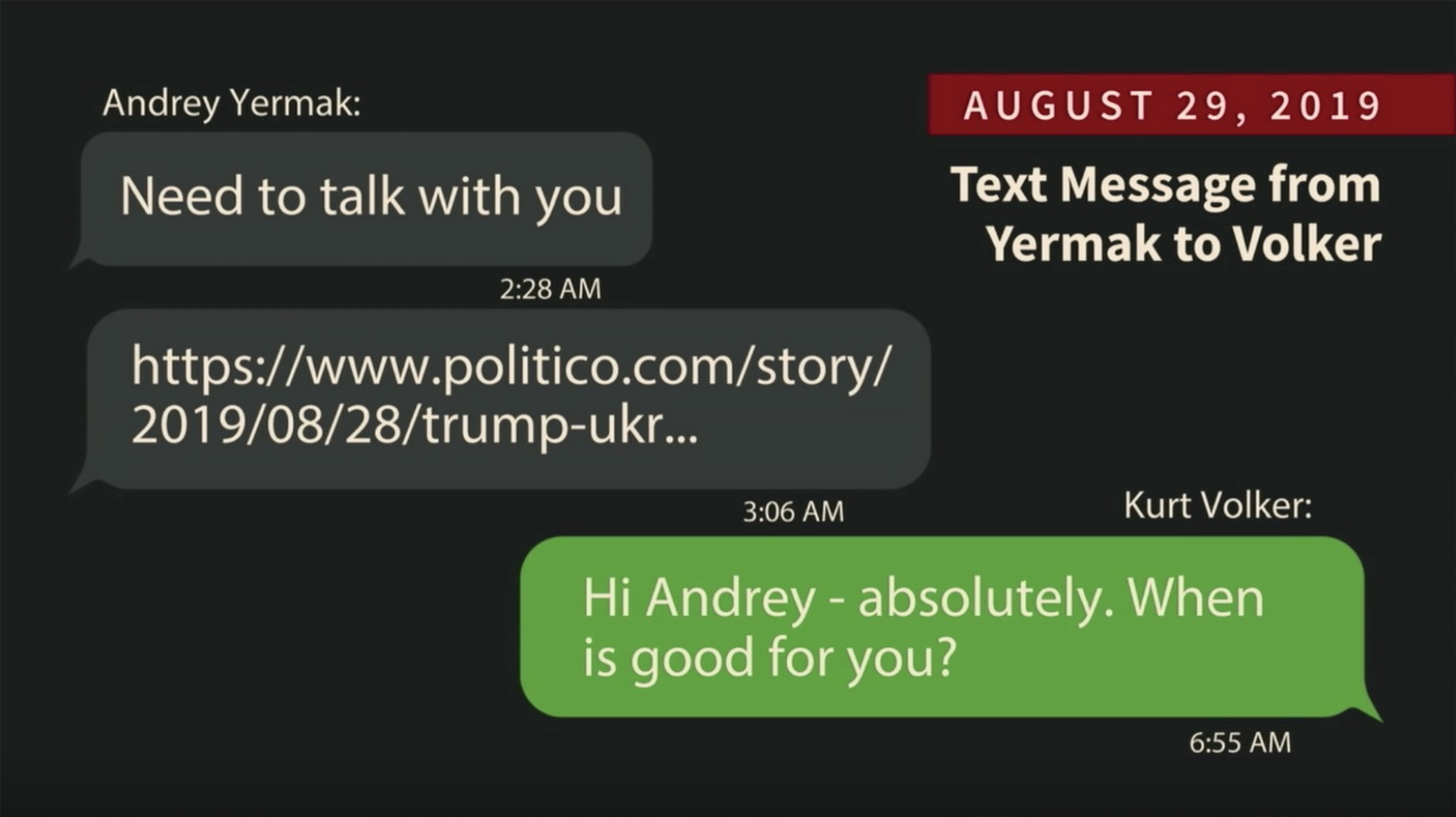
I wrote about this topic in 5 Litigation Graphics Lessons from the Impeachment Hearings. Many lawyers push back on retyping callouts because they believe a jury will feel like they are not looking at the real document. Here, most callouts have been retyped (unless they are a very high-quality scan), and it works. They used a technique I recommend which is to use a font that feels like the real document. As jurors become more sophisticated in their expectations, this will be the standard approach.
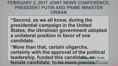
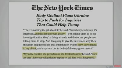
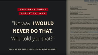
4. Quotes are elegantly handled.
All too often, trial lawyers demand wordy quotes be placed on a PowerPoint slide. Then they read them. Then they destroy persuasion. See Why Reading Your Litigation PowerPoint Slides Hurts Jurors.
Here, quotes are short and crisp. They appear professional, and they are effective.
5. Preparation and Practice
There's nothing more important than preparation and practice if you want to appear fluid when presenting your case. Both sides had clearly practiced, but on balance, I think the defense side came across as if their presentation was part of their argument rather than an interruption. This is the result of a lot of practice. See The #1 Reason Top Trial Teams Keep Winning and 10 Criteria that Define Great Trial Teams.
Conclusion
I'm not saying all of the work presented above was perfect from a persuasion standpoint. It's not. I can take issue with the use of ALLCAPS, color choices, font choices, and more. The work is, however, leaps and bounds more effective than what the prosecution (House Managers) presented. Taken as a whole, this style of work is in line with current and future juror expectations, and I'd love to talk with the artists behind it.
As you plan for your next trial, ask yourself, do your litigation graphics look more the image on the left (top for mobile) or the image on the right (bottom for mobile)? The litigation graphic on the right is more persuasive, better looking, and in line with current juror expectations. It's where you need to be now or be soon as a presenter.
Professionally produced PowerPoint slides work better because they look better and because they follow the rules of persuasion science. See Trial Graphics Dilemma: Why Can't I Make My Own Slides? (Says Lawyer) and Do Professionally Designed PowerPoint Slides Get Better Results?
As I have long said to trial lawyers at major law firms, even though you can, you wouldn't cut your own hair, so why would you try to design your own slides?
Other A2L Consulting articles related to the impeachment hearings and trial, litigation graphics consulting, persuading with PowerPoint, and more:
- Impeachment: 5 Litigation Graphics Lessons from the Impeachment Hearings
- Impeachment: Who Won the Impeachment Trial Initial Opening Statements?
- Impeachment: Impeachment Hearings Provide Trial Technology Lessons
- Still Think Persuasion is About Talking While Showing Bullet Points?
- 12 Reasons Litigation Graphics are More Complicated Than You Think
- 12 Ways to SUCCESSFULLY Combine Oral and Visual Presentations
- The 12 Worst PowerPoint Mistakes Litigators Make
- 21 Reasons a Litigator Is Your Best Litigation Graphics Consultant
- FREE Download: Why Using a Litigation Consultant is Beneficial to You
- 7 Lessons of Design That are Universal (in Trial Graphics or Anywhere)
- 13 Reasons Law Firm Litigation Graphics Departments Have Bad Luck
- Litigation Graphics: It's Not a Beauty Contest
- Download Free: Storytelling for Litigators Guidebook
- Why Reading Your Litigation PowerPoint Slides Hurts Jurors
- Free Webinar: 12 Things Every Mock Jury Ever Has Said
- 25 Things In-House Counsel Should Insist Outside Litigation Counsel Do
- 16 PowerPoint Litigation Graphics You Won't Believe Are PowerPoint
- The 14 Most Preventable Trial Preparation Mistakes
- 9 Things In-House Counsel Say About Outside Litigation Counsel
- The Top 14 TED Talks for Lawyers and Litigators 2014
- 12 Alternative Fee Arrangements We Use and You Could Too
- FREE Webinar: Persuading with PowerPoint Litigation Graphics
- FREE Download: Using Litigation Graphics
- 7 Questions Will Save You Money with Litigation Graphics Consultants
- 10 Types of Value Added by Litigation Graphics Consultants


Leave a Comment